Are you new to the Bay Area? Are you curious about where to find affordable housing? Do you want to get a better understanding of the Bay Area's diversity?
Bay Area Stats offers a graphical view of Bay Area demographic and housing data that lets you easily compare the characteristics of zip codes or cities.
Features
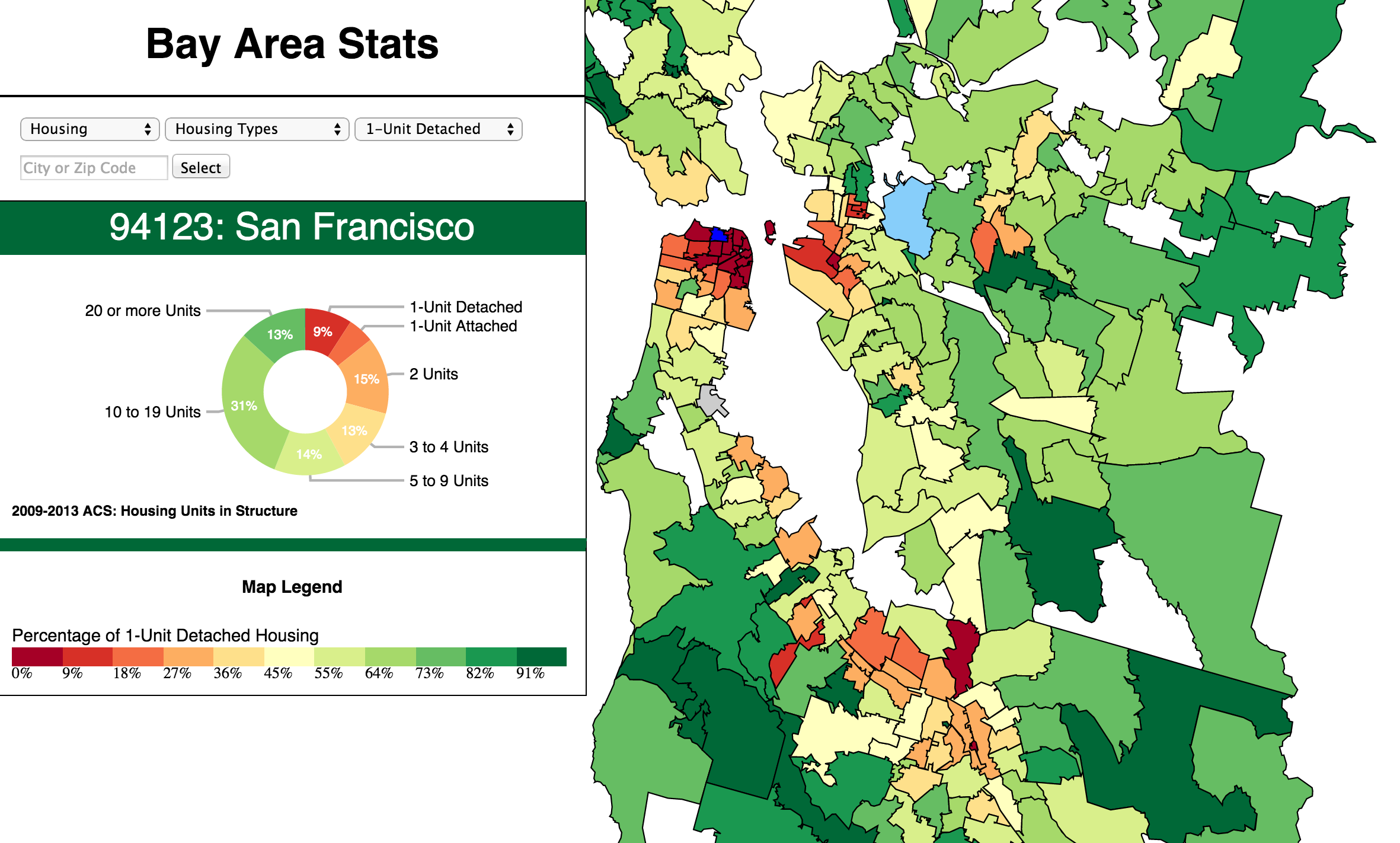
- Click, pan and zoom the map
- Enter a city name or zip code and click Select
- Change the menu to see Race/Ethnicity
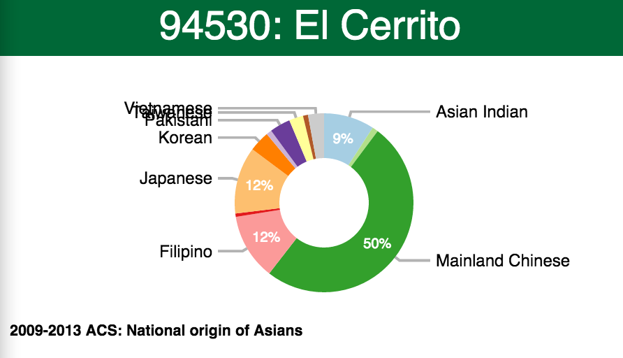
- Select Race: Asian and select Asian nationalities
- Notice how the pie chart changes when you click on different zip code regions. The pie chart changes are most interesting when the change in data is greatest. Select Race/Ethnicity or Race/Asian/Mainland Chinese and click between Daly City and Berkeley.
Inspirations and How To
Most of the functionality of this web application depends on the D3 (Data-Driven Documents) JavaScript library. I started learning about D3 by reading Visual Storytelling with D3 by Ritchie S. King. This is a fine introduction, but its scope is narrow, only covering how to make one type of bar chart.
I highly recommend reading Scott Murray's online D3 tutorial. Then read the book-length version of the tutorials: Interactive Data Visualization for the Web. Murray's book covers a broad range of D3 applications.
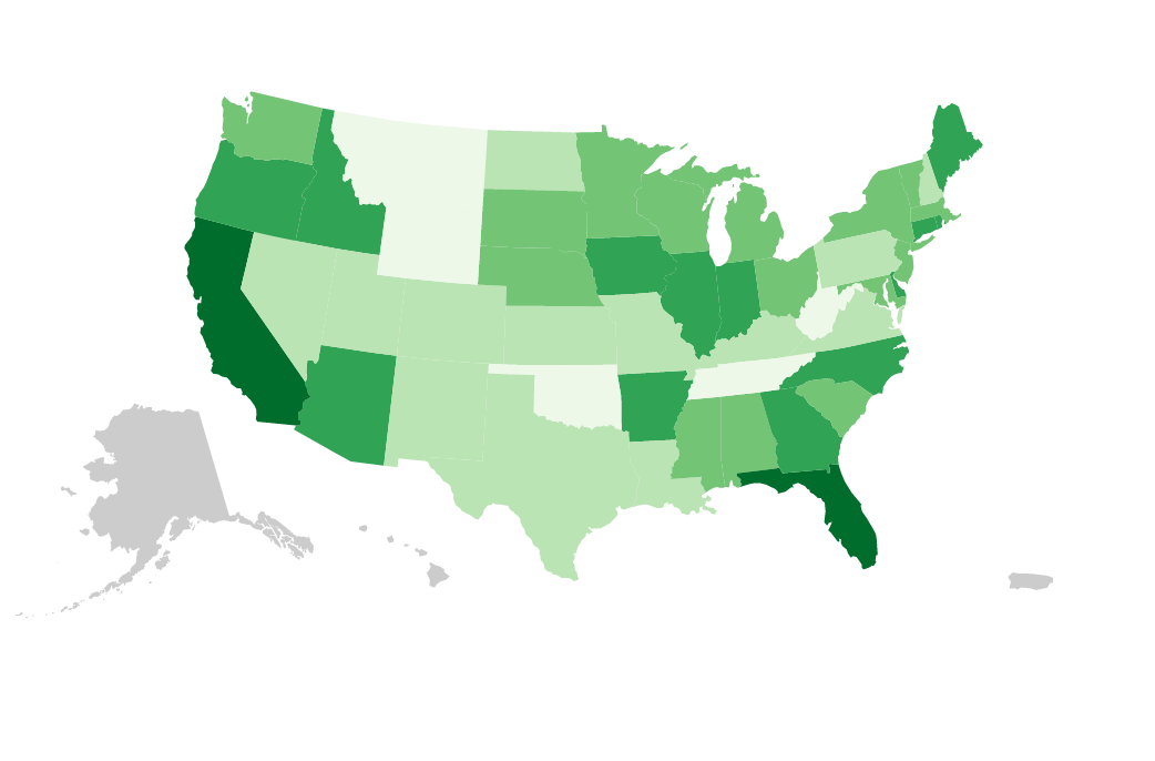
The example in Murray's book that inspired me the most was the Choropleth Map shown below. According to wikipedia:
"A choropleth map (from Greek χώρο ("area/region") + πλήθος ("multitude")) is a thematic map in which areas are shaded or patterned in proportion to the measurement of the statistical variable being displayed on the map, such as population density or per-capita income."
Chapter 12 of Murray's book has a very useful section called Acquiring and Parsing Geodata which details how to access rich sources of mapping data and convert them to a compact D3-compatible format. Geodata is collections of map boundary polygons whose vertices are expressed as latitude and longitude rather than x and y. This chapter lead me to explore the Census Bureau's library of shapefiles for zip code regions.
Murray's book whetted my appetite, but for a detailed how-to on converting GeoData I relied on Jim Vallandingham's excellent post, "From Shapefile to GeoJSON".
This post describes how to use multiple open source tools to convert Census Bureau files to GeoJSON. I used QGIS to extract a subset of the zip code boundaries from the national shape file. Then I used ogr2ogr to convert the extracted Bay_Area.shp file to GeoJSON.
ogr2ogr -f geoJSON -select GEOID10 Bay_Area.json Bay_Area.shp -simplify 0.001
The -select option indicates which database fields I want to associate with each region (GEOID10 is the zip code). The -simplify option controls the degree to which detail is reduced to compress the data.
I then was intrigued by the D3 pie chart examples on http://bl.ocks.org, especially the labeled pie chart which has animated transitions from one dataset to another. I was immediately captivated. This is eye candy that needs a real world application. Many of the D3 examples lack compelling data to make them relevant. Data at the state or county level is often too general to be interesting. I searched through Census Bureau data at the zip code level and found insights that truly drew me in.
I looked at three pie charts examples and borrowed code from each of them:
- Super transitions on data change, but overlapping labels: http://bl.ocks.org/dbuezas/9306799
- Super labeling, but no transition support: http://d3pie.org/
- Fade in/out for added/removed labels: http://bl.ocks.org/dbuezas/9572040
I found the code for #1 to be the most straightforward, but I liked the fade in/out of labels from #3. I used #1 as a base and added fade from #3. #2 is particularly interesting because it is a self-contained library for creating pie-charts in D3. D3 is a low level library. You have to be a proficient programmer to create a simple chart. D3pie allows you to create a rich pie-chart with minimal programming skill.
I then tackled the problem of overlapping labels. This occurs when you have multiple adjacent narrow wedges. If a wedge is too narrow you might omit the label, but this is not always the best solution. I found a couple examples where the overlapping label problem was addressed for static data, but none with animated transitions.
The solution I chose was to keep all the labels in columns on either side of the pie as in example #1. After the dataset transition is complete I check for overlaps. I address the labels on each side separately starting from the bottom. If label bounding boxes overlap I calculate a new position just above the previous label. Then I animate the transition to the new position. I also reposition the lines to each label.
Issues
I was conflicted about showing city names on the map. It is a complex problem to programmatically position map labels. You have to deal with overlap and decide whether to center, or justify each label. In addition, I might need to add city boundaries to the map. I found that the city limits were not what I expected. The city limits of San Francisco includes the Farallon Islands, 30 miles west of the Golden Gate. The label for San Francisco would end up out in the Pacific. Also, some zip codes are so tiny that they might be entirely obscured by labels.
To compensate for a lack of city labels I added tooltips on each zip code region and auto-complete to search for cities. When you search for a city by name the city is animated to the center of the map and the aggregated zip code data for the city is shown in the detail panel.
Sources
I used node.js scripts to do format conversion. As a node.js newbie the first thing I learned is that the built in classes don't provide the basic functionality that you would expect from a programming environment. It is a hassle to read from a file a line at a time using node.js alone. However, there are a myriad of open source node.js libraries that provide almost any functionality you might want. In this case the npm package "line-reader" did the trick.
http://www.irs.gov/uac/SOI-Tax-Stats-Individual-Income-Tax-Statistics-ZIP-Code-Data-(SOI) (tsv files)
http://factfinder.census.gov/ (csv files)
http://www.zillow.com/research/data/ (csv files)
http://www.myapartmentmap.com/ (acquired by webscraping using node.js script)
I acquired city names for each zip code using the ziptasticapi.com webservice.
Future Enhancements
-
Use HTML cascading menus.
-
Provide Server-side support to allow dynamically expanding to other metropolitan areas.
-
Add bar charts for apartment rents with animated transitions.
To scale this app up to national scope I would want to preprocess the data files so that I could access the data by geographic proximity. Maybe it would be sufficient to divide the data by US state.